
Spark Education
Case Study - User Research, Informational Architecture, New & Improved Sign-up process
Role:
UX Designer
UX Researcher
Timeline:
6 Months
Core Responsibility:
Lead the end-to-end projects and collaborate with cross-functional teams.
The Mission:
1. Get to know our users.
2. Testing current designs and gathering feedback for iteration.
3. Brainstorming new ideas and features for Spark's website.
4. Test new designs and continue iterating for further improvements.
The Outcome:
1. Identified five distinct parenting groups through multiple rounds of user interviews and testing.
2. Created multiple personas and empathy maps, providing invaluable insights into the target audience.
3. Introduced new homepage architecture tailored to all parents and learners.
4. Introduced new user-friendly sign-up process.
The Impact:
1. 20% surge in our conversion rate.
2. 25% decrease in our bounce rate.
3. 85% boost in user engagement.
4. Stronger bond between cross-functional teams
Introduction to Spark Education
Spark Education is an innovative educational technology company with a compelling mission: to revolutionize math education in a gamified method. Renowned for our widespread popularity in Asia, we've ventured into the U.S. market with Spark Math. Our comprehensive offerings cover K-6th grade, providing invaluable math support, competition preparation, and the convenience of live teacher assistance.
Within our dedicated UX team, led by a Head of Design and two UX Designers, we embarked on the mission to establish a strong foothold in the U.S. education sector. Our primary objectives revolved around brand establishment, identifying our users / targets, fostering trust among families, and crafting a seamless experience to educate parents about how our courses can empower their children to excel in the classroom.

Goals and Objectives:
At Spark Education, our mission was to revolutionize the Ed-Tech industry by enhancing the user experience for both students and educators. We aimed to provide innovative solutions that make learning more accessible, engaging, and efficient.
My goals for this project were broken down into three steps:
1. Gather information on parents, parenting style, preferences, expectations, end goal for their child.
2. Using our research to redesign landing pages with new features, more information tailored to different parenting styles, and build trust with families.
3. Redesign our sign-up for a quicker and user-friendly process.

The Problem:
We faced the challenge of improving the user experience on our platform. User feedback indicated that our current design was not intuitive, leading to frustration and lower engagement levels.
Additionally, our sign-up process was time-consuming and required simplification. To address these issues, we needed to gain a deep understanding of our users through research and revamp our informational architecture to make content more accessible.
Sign-up
Time-consuming
Informational Architecture
No Engagement
The Solution:
I began a robust user research phase to understand the pain points and preferences of our users. This research would later guide our efforts to create a new informational architecture that organized content in an intuitive and user-centric manner.
During the user research phase, I had the privilege of collaborating closely with our dedicated Customer Insights team. With their support, I crafted designed scripts for user testing sessions, engaging both potential users and our current user base. These sessions provided invaluable insights into the needs, preferences, and pain points of our audience. By working in synergy with the Customer Insights team, we ensured that the research process was thorough and user-centric.
.png)
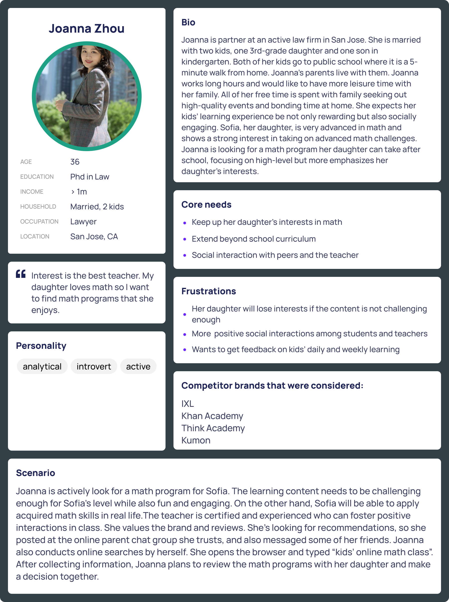
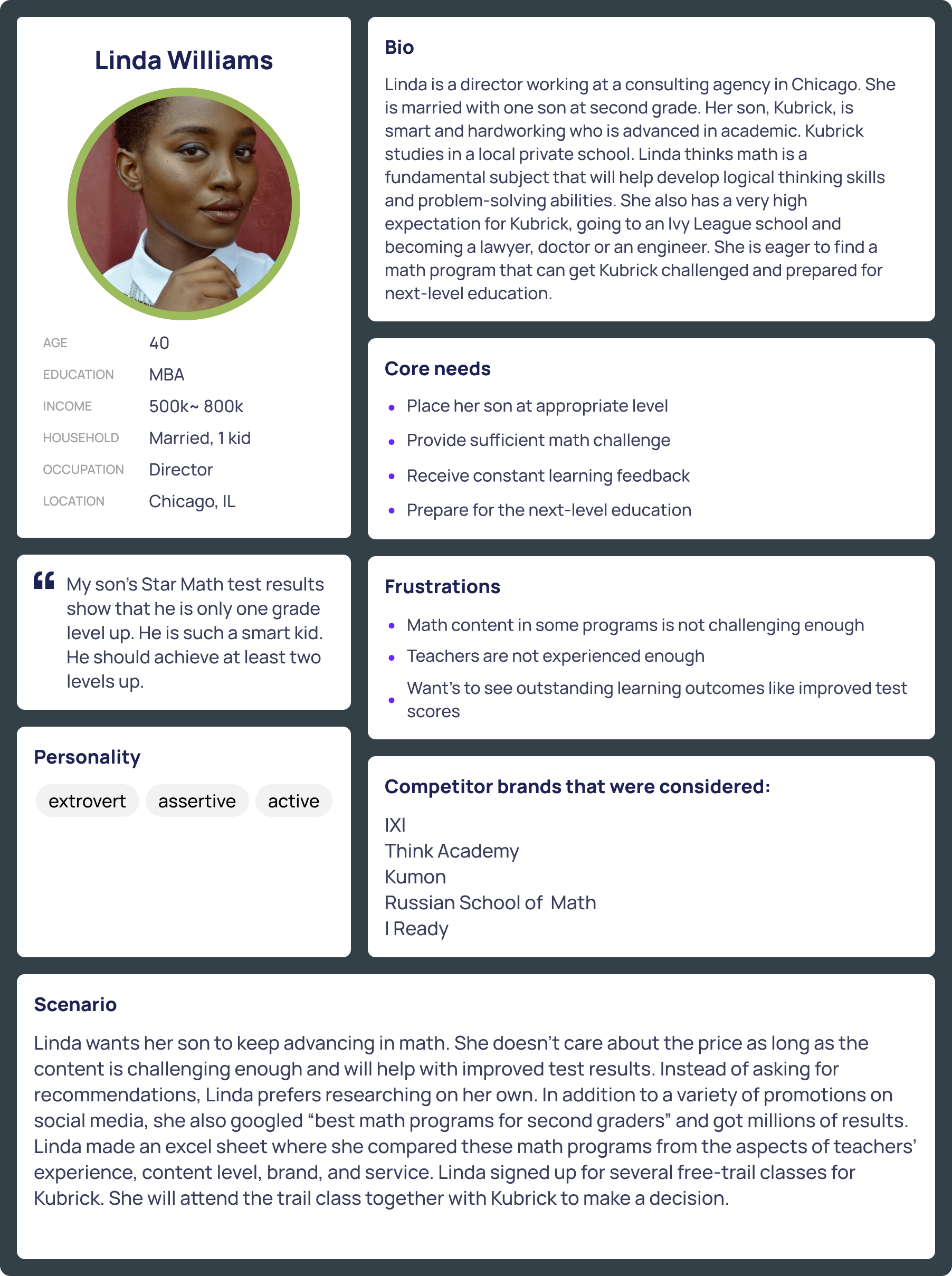
User Research Findings:
From speaking with our current users and potential users, I was able to identify 5 parenting styles, each with their own unique perspective on math and education.
Dolphin Parents - known to be firm, yet flexible and relies heavily on social communication and interaction.
Tiger Parents - an authoritarian parent. Tiger parents consistently push their children to achieve both at school and in extracurricular activities.
Jellyfish Parents - permissive parent. They have few rules or expectations, and often overindulge their children.
Helicopter Parents - a parent who pays very close attention to a child's or children's experiences and problems, particularly at educational institutions.
Elephant Parents - often parents who are very protective of their children. They prefer to focus on nurturing their children’s emotions rather than their athletic or academic achievements.
How Might We?
Using "How might we" statements to explore ways to emphasize the value of math to parents who may have different perspectives on its importance.
Question 1:
How might we provide advanced math resources and challenges that cater to parents seeking to foster a strong mathematical foundation in their children?
Question 2:
How might we integrate gamification elements into math education to engage parents who appreciate interactive and immersive learning experiences?
Question 3:
How might we make math learning more approachable and enjoyable for parents who have reservations about the subject?
Interactive Demo
To provide parents with a more comprehensive understanding of our courses and gamified lessons, I proposed incorporating a game demo prominently on our landing pages and homepage. This not only offers parents insights into our offerings but also engages their children in an interactive demo, sparking enthusiasm for our products.
.png)
.png)
New Testimonials
Our testimonials, featuring report cards shared by parents who have witnessed exceptional growth during their child's educational journey with us.
Our primary objective was to infuse authenticity into our platform, providing tangible evidence of the effectiveness of our curriculum and the experience by showcasing the real progress and achievements of our young learners.
Different Parenting Style
Crafted from exanimating our distinct parenting groups, each with their unique perspectives and value towards mathematics. Our aim was to forge a connection that resonates with all of these diverse groups.
This feature not only addresses their varied views on math but also laid the foundation for an exciting proposal. I recommended creating a self-assessment test for students, a tool that empowers parents with a deeper understanding of their child's educational needs within our program.
.png)
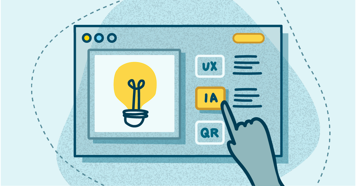
Competitive Analysis
PHASE 3 – Deeper dive into competitive analysis
Upon initiating usability testing for my redesigned interfaces, I started on an extensive competitive analysis. Given the substantial scope of this project and its reliance on cross-functional support, I focused on garnering buy-in from stakeholders by voicing the necessity for a revamped information architecture (IA).
Below are 2 of 8 competitors I closely analyzed. I divided each section to break down their IA. Green indicators are sign-ups and CTA's, blue indicators are trust factors, and orange indicators are for key product selling features.
Studying how our competitors structure their information and noticing the unique design choices they make will help us figure out why their layout works so well and is successful.
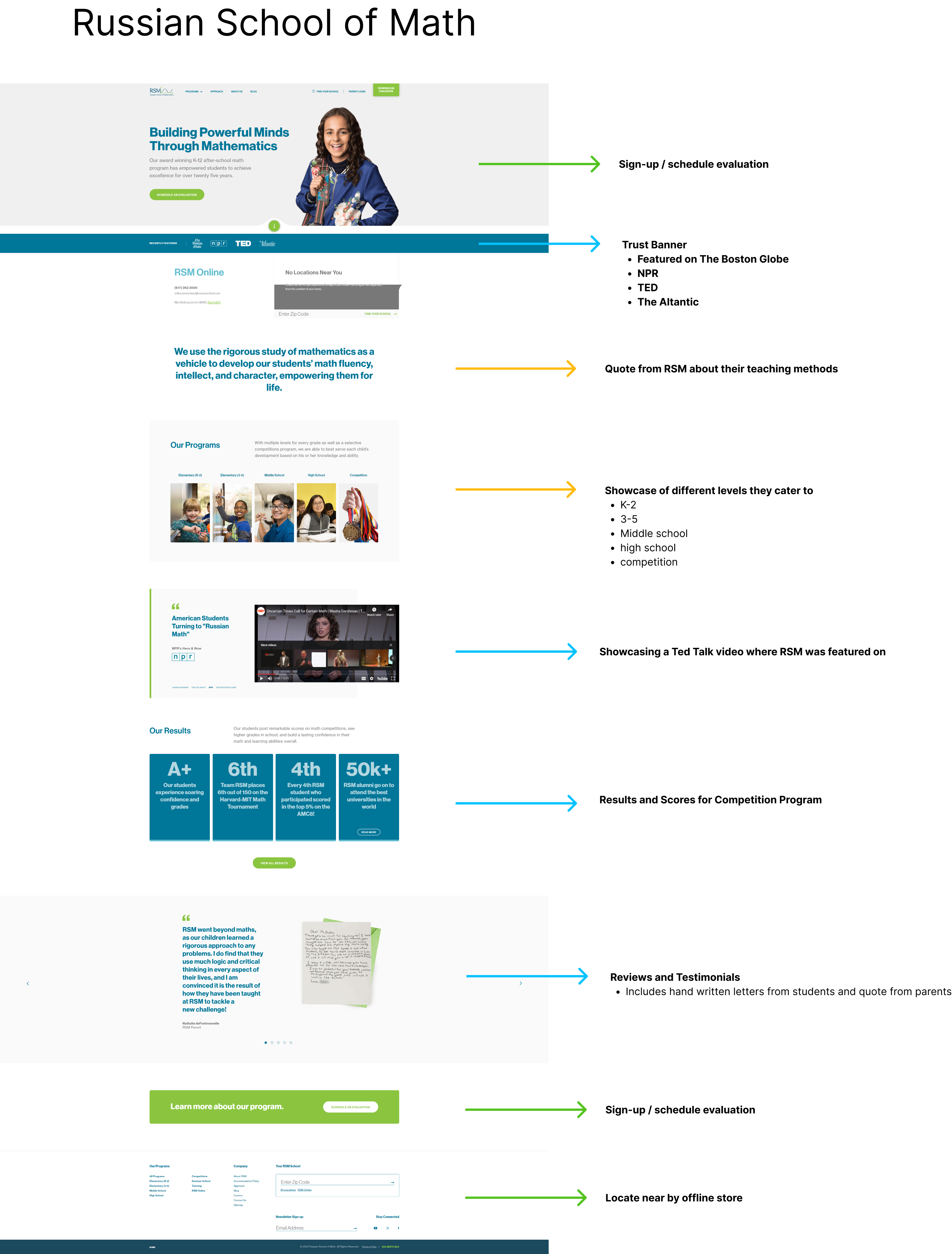

New Informational Architecture
Following several rounds of rigorous usability testing involving the new testimonials, parent cards, and product demo, we received overwhelmingly positive feedback. Parents showed genuine enthusiasm for the enhanced features and demonstrated significant interest upon discovering Spark Education's comprehensive offerings, catering to a diverse range of learning styles and preferences.
Below is our new layout after user testing and iteration based on feedbacks.

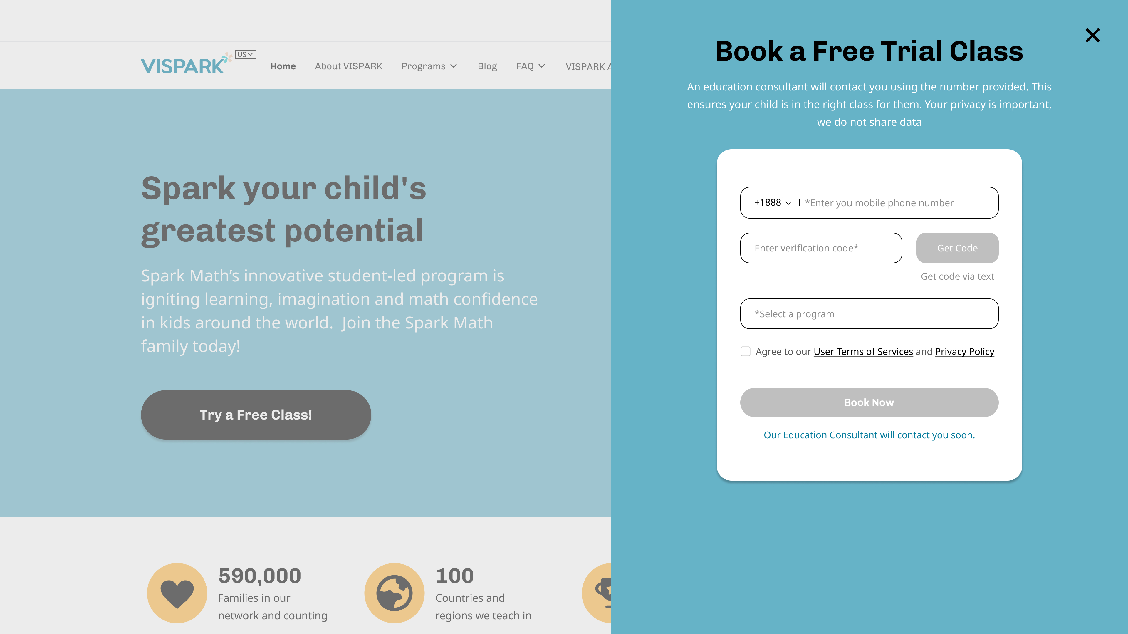
Sign-Up Process
Next Step – Taking a closer look at our sign-up process

STEP 1: Users click on any CTA or "Free Trial Class"

STEP 2: Users will be redirected to top of webpage with a pop-up
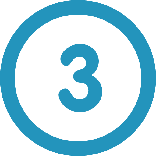
STEP 3: Users will enter the program they are interested in and their phone number. A verification code will be sent to the phone for confirmation

STEP 4: Parents will need to wait until our EC team or sales team contacts them
The Problem
The biggest issue identified with our current sign-up process was the wait time and unexpected call from our Sales Team.
It left our potential customers confused and waiting to learn more about our program. From our user interviews and research, we discovered that parents want to be in control of when they will be receiving our call and some feel hesitant about giving out their personal information.
User-Flow Chart & Presenting to Stakeholders
From the competitive analysis I conducted earlier, I also took a look into what other leading EdTech companies are using for their sign-up. I went through each companies sign-up process, taking notes and understanding their user flow.
After identifying our users pain points and needs, I led a presentation to our cross-functional teams and stakeholders to share the value and importance of this project. The image above was a crucial factor to giving a better visual of our process compared to others.
Presentations about analytics and statistics can persuade some, but having a visual representation gives everyone a better understanding of the importance in UX design. My team and I were able to not only get the approval for this project, but received full support from all teams after our successful presentation.

The Process
PHASE 5 – Wireframing, Prototyping, Mockups
Following our successful presentation, our UX team transitioned to work on various projects simultaneously. My focus remained on wireframing, progressing to high-fidelity mockups for presentation to the team.
We conducted multiple UX workshop sessions, for brainstorming innovative ideas to enhance our new sign-up flow. These collaborative sessions generated valuable recommendations, culminating in the development of our refined and improved sign-up process.

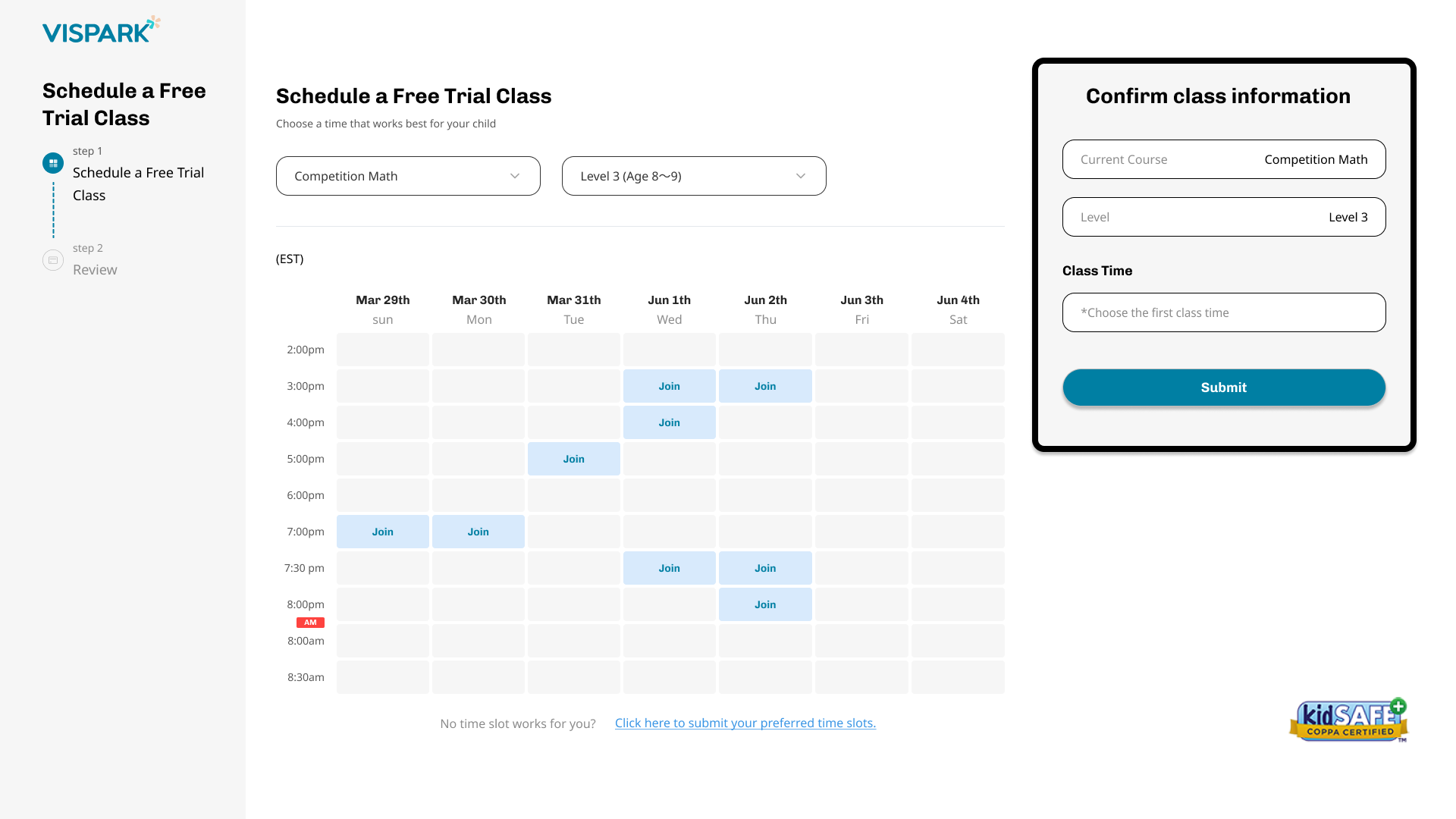
New Sign-Up Process
Our new process gives our users control throughout the whole process, from start to finish. Utilizing our competitive analysis and user research, I had a great understanding of what is missing in our market and what the users prefer.
Our new sign-up process met all of our users needs including:
1. Ability to set a time that best fits their schedule for a phone call
2. User-friendly UI for easy navigation during sign-up.
3. A clear understanding of our process and respecting our users schedule.


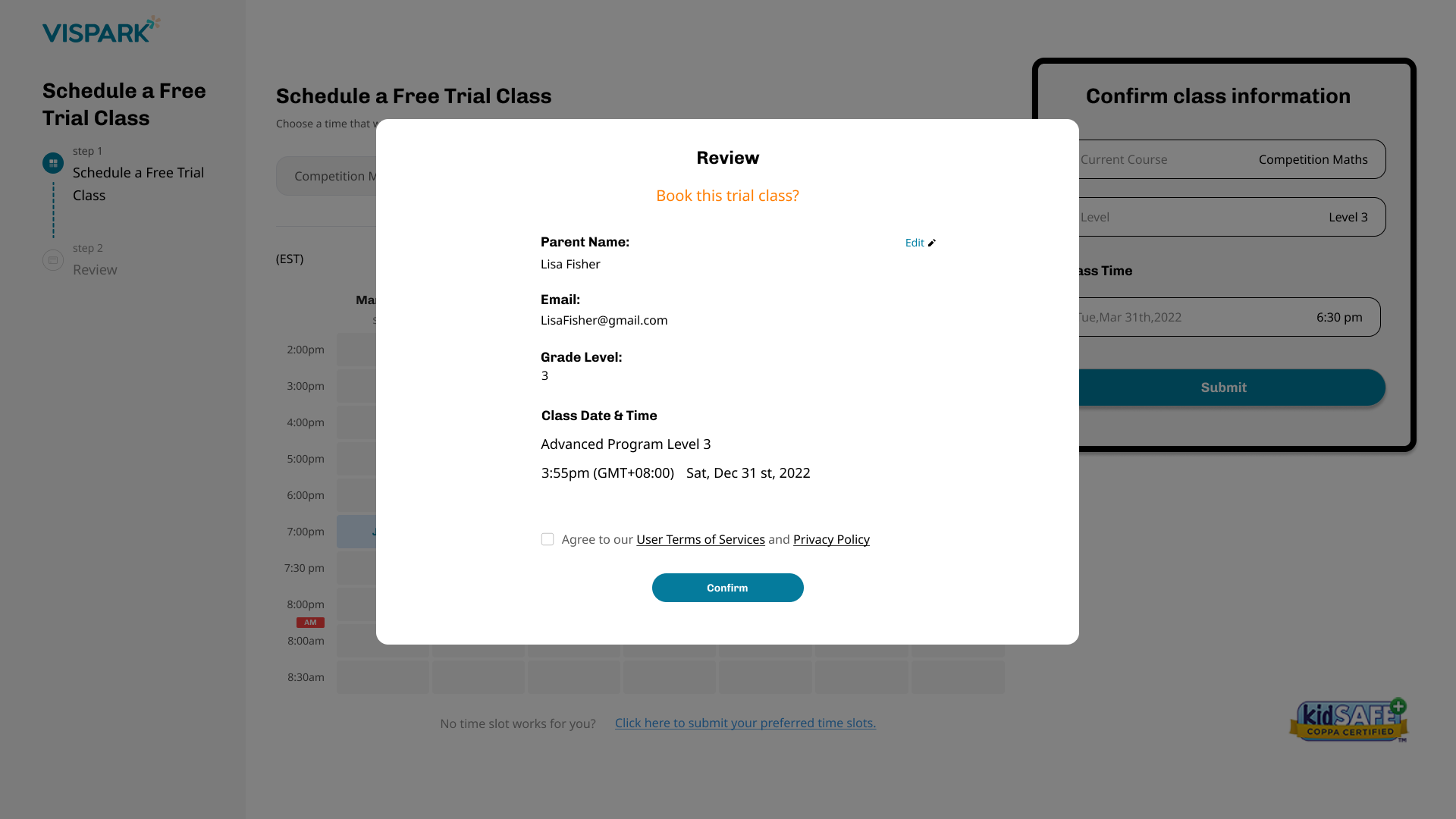

Usability Testing & Results
The results from our recent usability testing of the revamped sign-up process and the feedback is overwhelmingly positive.
Efficiency Improvement: Participants reported a notable reduction in the time required to complete the sign-up process. The streamlined flow and clearer instructions contributed to a more efficient onboarding experience.
Enhanced Clarity: Users praised the improved clarity in each step, with a particular emphasis on the simplified language and visual cues. This clarity resulted in a smoother journey through the sign-up process, reducing instances of user confusion.
Positive Visual Appeal: The visual aesthetics of the new design received positive feedback. Users appreciated the modern and cohesive look, stating that it instilled confidence in the platform's reliability.
Increased User Confidence: Participants expressed increased confidence in completing the sign-up process successfully. The combination of improved guidance and a more visually engaging interface contributed to a positive overall perception of the platform.
Takeaways
One of my biggest fears is public speaking. It's ironic because I used to excel at public speaking in college and I was a salesman before UX. Something about presenting to stakeholders was intimidating in the very beginning. "Are they bored? Am I making sense? Is this meeting taking forever or is it too short? Do they understand the goal of this project?" These questions often make me forget the whole purpose to why I am even giving a presentation in the first place.
One valuable recommendation from my manager was to shift our approach from a traditional presentation to a more engaging and interactive activity. This inspired me to craft an effective solution during my pitch, aimed at transforming our sign-up process. Recognizing the competitiveness across departments and that we are a gamified EdTech company, I decided to gamify our presentation using Kahoot.
This approach not only created excitement into the meeting but also served as an educational opportunity for other teams to gain a deeper understanding of the UX team's role as a valuable business partner. Through this gamified presentation, I successfully delivered crucial information about diverse parenting groups, the insights from the competitive analysis, and the benefits of adopting a self-serve signup model.